
1: Long Term Temperature Trends
The purpose of this study was to observe fluctuation in temperatures as the result of the time of year. The data used in this activity was specifically used to consider climate change. Data used from researchers (Robbirt et al.) shows monthly temperature data from 1659-2016. This data was then used to make multiple scatterplots. The results that we observed showed an increase in temperature over time, and is further discussed below.


1.For your scatter plot graphs, which variables did you plot on the x-axis and y-axis? Explain why.
For the three scatter plot graphs that were formulated from the data, we chose to place the year on the x-axis, and the mean temperature on the y-axis. We made the conscious decision to place the year on the x-axis due to the variable being the one that is the most consistent and never changes throughout the observation. On the other hand, the temperature was placed on the y-axis due to the variable being dependent on the time of year and the month range. Additionally, the temperature was a direct reflection of the time of year it was.
2.Based on the trend line, describe how annual temperature has changed over time. How has temperature changed in February –April? In March –May?
Based on the trend line from the observed data, the annual temperature appeared to fluctuate up and down roughly from about 7.00-11.8 through the years of 1650-2000. In accordance with the previous statement, the R2 value which was 17.46%, illustrated that the annual temperature moderately explained the variability of the data. In the months of February through April, the temperature evidently had a large fluctuation which ranged from about 2.9-8.5, and an R2 value of 8.7%. This specific graph illustrates that the years had a direct effect on the heavy increase and decrease of the temperatures. Lastly, the March through May graph represents a more consistent change in temperature in comparison to the February-April graph discussed. Additionally, the temperature in the March-May graph didn’t show much of a huge drop or huge increase.
3.Calculate the correlations (R²) in the Mean Temperature (February –April) vs. Year and Mean Temperature (March –May) vs. Year scatter plots. Which graph depicts the strongest relationship between temperature and year? Explain your answer.
The graph that depicts the strongest relationship between temperature and year is the March through May scatterplot. This conclusion stems from the points on the graph being closest to the trendline, which indicates a strong relationship between the two variables. Equally important, the February-April graph displays a greater fluctuation of temperatures in response to the year.
This section was completed by Jayla Watkins.
2: Pollination of the Early Spider Orchid by the Solitary Bee
The purpose of this activity was to examine flowering phenology of the Ophrys sphegodes, or the early spider orchid. Specifically, this data compared the peak flowering dates of orchids to the first flight of spring in bees. The data used in this study was taken from the British Museum, Royal Botanic Garden, and the UK Meteorological Office—citizen scientists were also used. The results of this study show a direct correlation between peak flowering times and bee first flight over a course of over 100 years.


1. At 7°C, how does the timing of the arrival of the bees compare to the peak flowering time?
At 7°C the peak flowering time are much lower than bee first flight. The minimum for bee first flight at 7°C is 22 and the maximum is 119. The minimum for peak flowering time at 7°C is 72 and the maximum is 112. The minimum values for each of the organisms differ greatly, but the maximum values only differ by a few digits. This represents that bee first flight will usually be higher at lower temperatures.
2. At 10°C, how does the timing of the arrival of the bees compare to the peak flowering time?
At 10°C, there is a dramatic shift from the results seen from question 1. Around 10°C, the majority of bee first flight is very high, but these values are outliers from the majority of the rest of the bee first flight values. Unlike peak flowering time, there seems to be no direct correlation between the mean temperature and bee first flight. On the other hand, peak flowering time seems to have a direct correlation with temperature because as the temperature rises the amount of days of peak flowering time decreases.
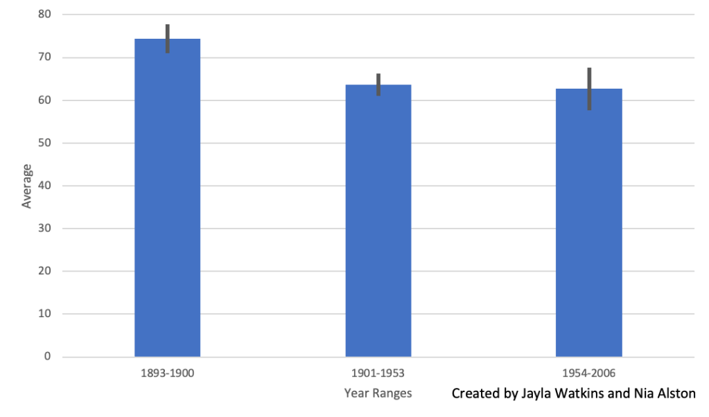
3.How does bee activity and orchid flowering timing compare from the beginning of the century (1848 –1900) to the end of the century (1954 –2006)?
In the beginning of the century, between the years 1848-1900, the average for peak flowering times was 76.7. At the end of the century, the average for peak flowering times was 74.2. As seen in Figure 4, the average peak flowering times over the years have fluctuated between higher and lower temperatures. Between the years 1848-1900 the average bee first flight was 74.3, and between the years 1954-2006, the average was 62.7. Figure 5 shows that the average bee first flight took a significant decline between the years of 1848-1900 and 1901-1953. This decline remained relatively constant after 1953.
4.Predict how continued increases in global temperature might affect the reproductive success and abundance/existence of Ophrys sphegodes. Use evidence from the graph to support your prediction.
The reproductive success of the Ophrys sphegodes is heavily based on insect pollinators, such as bees. When insect pollinators, like bees, emerge, they need the pollen of plants to be successful and be able to participate in activities, such as reproduction. If the plants have not bud when the insects emerge, the insects will find a new plant to pollinate with; thus, leaving the plant without a pollinator and hurting its reproductive success. The graph shows that Ophrys sphegodes do not bud until they are in higher temperatures, and may of the bee first flight events take place at lower temperatures. If the majority of bees were to try and find plants to pollinate at these lower temperatures, many of the plants would lose pollinators; thus, hurting the reproductive success of the Ophrys sphegodes.
This section was completed by Nia Alston.
3: The Relationship between Insect Emergence Patterns and Temperature

As a science communicator, how would you use today’s lab experience to explain the pattern discussed in the Scientific American article titled, Brood awakening: Periodical cicadas emerge early? Are there alternative hypotheses to explain what happened in 2017?
From today’s lab experience and as a science communicator to the general public, I would state that temperature and the time of year go hand and hand, especially in the decade we’re in now. With each new year or decade, we can compare the average temperatures to that of past climate changes to have an accurate overview of temperature fluctuations and the reasons for this. Additionally, climate change has become a huge topic in most day to day discussions and how these increasing temperatures not only affect the human population, but everything within the environment. Moreover, I believe that the scientists in the article were head on with their hypotheses about this particular species. Like stated before, climate change directly affects the processes and functionality of both humans, animals, plants, and insects. Consequently, this throws off the entire balance of nature and how all things within it are forced to adapt to this frantic change.
This section was completed by Jayla Watkins.
4: Climate Change & The General Public

According to a 2016 Pew Research Poll, roughly half of United States adults say climate change is due to human activity and expect negative effects due to climate change. As a science student and communicator, what are examples climate change impacts that the general public might have experienced? What are some challenges associated with communicating to the general public about climate change?
Based on the 2016 Pew Research Poll, half of Americans realize the impact that humans have had on climate change and its negative effects. One effect of climate change that affects the general public is the drying of lakes which affects drinking water. Many lakes in the western United States are so dry that it now is beginning to affect the groundwater supply for billions of people. Climate change has also affected human health. Burning fossil fuels leads to and increase in air pollution—affecting the respiratory systems of all citizens. Carbon emissions, causing a greater impact from climate change, along with other sources have caused an increase of the Earth’s temperature. This temperature increase of the Earth can lead to heat-related illnesses and overall damage to human health. One of the main challenges of communicating to the general public about climate change is the amount of people who may disagree with climate change. Those who believe in climate change usually have no problem taking in issues and ideas associated with climate change, but those who do not believe in it usually do not wish or want to be persuaded. Today a lot of the general public’s opinion on climate change is based on politics. Climate change communication to the general public is based on ease of communication and how political parties talk about climate change play a significant in the public’s view of climate change (Anwar). While it is important for the public to make their own decisions on topics like climate change, the media and other outlets have a strong pull on citizen’s opinions.
This section was completed by Nia Alston.
References: Anwar, M.A., Zhou, R., Sajjad, A. et al. Climate change communication as political agenda and voters’ behavior. Environ Sci Pollut Res 26, 29946–29961 (2019). https://doi.org/10.1007/s11356-019-06134-6.
The first and third sections of this post were completed by Jayla Watkins. The second and fourth sections of this post were completed by Nia Alston. The six graphs were completed by Alston and Watkins, collaboratively, with the use of Microsoft Excel.
