Biodiversity is the variety of life in the particular habitat or ecosystem. For this week’s lab we examined the species diversity of plants in our backyards at home. We also compared the plant species diversity of both of our backyards. The Shannon-Wiener Index was then used to determine the more diverse ecosystem. The Shannon-Wiener Index is determined by both the number of species and the evenness of the distribution of individuals among those species. The number of species can also be referred to as species richness. Below is the data that was collected.
Species (i)
ni
pi
Log2Pi
pilog2pi
Iris
4
0.04
-3.22
-0.1288
Wild Violet (weeds)
100
1
0
0
Quickweed
20
0.2
-1.61
-0.322
Creeping Charlie
50
0.5
-0.69
-0.345
Weedy Daisies
6
0.06
-2.81
-0.169
Bindii
30
0.3
-1.2
-0.36
Raspberry Weed
40
0.4
-0.91
-0.364
s=7
sum=250
-1.7
Shannon Diversity Index (H)=1.7
Hmax= 1.95
Evennes= 0.87
Table 1. Jayla Watkin’s Shannon-Wiener Index
Photo by Nia Alston
Species
i
ni
pi
log2pi
pilog2pi
Yellow Buckeye
1
1
0.037
-1.432
-0.053
Mockernut Hickory
2
10
0.37
-0.432
-0.16
Sweetgum
3
7
0.259
-0.587
-0.152
Slash pine
4
6
0.222
-0.654
-0.145
Northern Red Oak
5
3
0.111
-0.956
-0.106
-0.616
H: 0.616
Shannon Index
0.616
Species Richness
5
Evenness
0.881
Table 2. Nia Alston’s Shannon-Wiener Index
Identify the backyard that was most diverse.
The backyard that was most diverse was Jayla’s yard, which indicated a Shannon Wiener Index value of 1.7 in comparison to Nia’s which was 0.616. The species identified also differed with Jayla having a total of 7 species, and Nia having a total of 5 species.
Did any single species exhibit dominance in either community? Write a plausible explanation why you think this occurred.
In Jayla’s backyard, the wild violet weed was the most dominant species out of the other 6 species. This most likely occurred due to the plant’s ability to self-seed in optimum conditions, thus making them crowd many lawns. Additionally, the weed can be utilized for medical purposes and is an edible plant.In Nia’s backyard, the most dominant plant species was the Mockernut Hickory. This species was the most dominant because of its ability to grow in favorable conditions, which is usually humid environments. This specific species of trees also has a life span ranging up to 500 years, thus making it the most abundant of its kind. A special characteristic about the Mockernut Hickory is that its wood is often utilized for products that require strength, flexibility, and hardness.
What global locations and physical characteristics of an ecosystem could cause it to have a high value for the Shannon-Wiener Index? Explain.
The Shannon-Wiener Index, H, is a measure of diversity in an ecosystem, so it can be assumed that ecosystems with larger species richness would have a higher Shannon-Wiener Index. For example, tropical rainforests are ecosystems with high biodiversity and biomass which lead to a great species richness, R. When calculating the Shannon-Wiener Index, species evenness also needs to be accounted for. Global locations that have high species richness, but also face great episodes of extinction will have a lower H value—a common occurrence in tropical and dry forests. Temperate deciduous forests are another climate that would most likely have a high H value for the Shannon-Wiener Index. This climate has rich, fertile soils and seasonal climates which can be favorable for organisms. Climates like the tundra and deserts are least likely to have high Shannon-Wiener Index values. These climates are not ideal for organisms because they possess qualities, such as extreme variation in temperature and precipitation and hard, poor soils.
The importance of biodiversity has been positively correlated to ecosystem resilience and stability. According to your results, which backyard demonstrates the higher degree of ecological stability? Explain why this relationship exists.
An ecosystem that exhibits ecological resilience and stability is able to return to a state of equilibrium after an ecological disturbance. Mutualism between organisms, plants and animals, in an ecosystem are crucial to the organization of ecological communities. The plants from Jayla’s backyard could be found if the location was to go through secondary succession, a process where disturbances do not eliminate all life and nutrients from the environment. The plants in Nia’s backyard may be less likely to come back or they would take a longer period of time to regrow. Due to this, Jayla’s backyard demonstrates a higher degree of ecological stability. A greater amount of biodiversity allows for an ecosystem to bounce back from disturbances because biodiversity affects biomass production and nutrient cycling which affect ecosystem services.
Citation: Suweis, S., Simini, F., Banavar, J. & Maritan, A. (2013). Emergence of structural and dynamical properties of ecological mutualistic networks. Nature, 500, 449–452.
Author Contributions: The data collected and calculated was completed by Nia Alston and Jayla Watkins separately for their respective environments. The introduction and question 1 & 2 were answered by Watkins. Questions 3 & 4 were answered by Alston.
This week’s lab, Cat Tracker, used animal tracking data from http://www.movebank.org. The data is retrieved from GPS devices that are attached to cats. The GPS tracker records all the places the cat visits, and the data is then uploaded onto the data bank. After uploading onto the data bank, it can be opened in Google Earth and used to find the area of the cats home range. An animal’s home range is where an animal travels through familiar places to obtain food, seek shelter, or find mates. We analyzed domestic cats from the U.S.A, New Zealand, and Australia to test the average number of hectares traveled by cats from these different countries. Each person from our group chose fifteen cats from each of the three countries on to collect data from to find the mean of each group. This data was used for further analysis seen below.
1.What were the average home ranges for cats in each of the countries? Make a bar graph of the average home ranges by country.
The average home range for cats in the United States was 7.84 hectares. For visualization, one hectare equals about the size of ½ of a football field. The standard error for the United States was the smallest out of the data sets, at 0.957. This represents the most accurate reflection of the dataset. The average home range for cats in New Zealand was 5.37 hectares. This dataset included the largest home range out of all three countries at 39 hectares. The cat with this home range lived in the suburbs, but had made its way into the mountains. The average home range for cats in Australia was 4.88 hectares. The data from Australia had the smallest average. One reason for this could be that we unknowingly selected cats with smaller ranges. Another reason for this could be that 85% of Australians live in cities or urban areas, and the majority of Australia is uninhabitable deserts. Lack of citizens in rural areas may have caused a lack of cats with larger home ranges. This data can be seen represented in Figure 1.
Figure 1. Average Area vs. Tracked Countries. Figure 2. One-way ANOVA for tracked cats from the U.S., New Zealand, & Australia
2. Based on your observations in Google Earth, what types of habitats were in the cats’ home range?
Based on the observations from google earth, the types of habitats in the cats’ home range were mostly rural, suburban areas with more open space for the cats to travel. The cats’ home range appeared to be bigger when the area was more urban, and more spacious for the cats to hunt and explore.
3. How did the cat’s location (urban, rural) influence it’s use of the landscape?
Cats that were located in urban areas seemed to frequent areas that had some type of cover. This includes being located near homes and other buildings. Some of the cats were located under trees and bushes, as well. Many of the urban cats used streets and sidewalks to move from place to place, and it was not as common to see cats travel through backyards or other grassy areas. The cats in rural areas spent most of their time near trees and other types of vegetation which is similar to the cats from urban areas. Since the cats from rural areas had greater home ranges, they may have been searching for buildings or homes to use as a cover.
4. What abiotic and biotic factors might influence the size of the cats’ home range?
Abiotic factors that might influence the size of the cats’ home range could be the area in which the cat lives and travels, which could be a city versus a suburb, areas that contain large buildings and bustling streetways, and areas that are more remote and less busy. Biotic factors that could affect a cats’ home range could be other large animals that they encounter while roaming different areas. These predatory animals could be a large determinate in the areas they choose to travel through.
5. Based on the cats’ home ranges in your data set, what might that suggest about cats’ potential impact on local biodiversity?
Based on the home range data collected, it might suggest that house cats for example, more than likely will not have an overall effect on local biodiversity. On the other hand, cat species like federal cats, may have a bigger impact on other small animals in the area such as birds.
6. You are an urban developer interested in designing a city safe for both cats and local biodiversity. Based on the cat’s home ranges, what landscape changes might you implement to accommodate cat’s roaming behavior while protecting local wildlife?
Cats are one of the biggest threats to many local wildlife species. The life of animals, like rabbits, birds, moles, mice, and rats, are highly threatened by cats that are free-range and domesticated. Adding trees, bushes, and other plants that can contribute to dense vegetation gives birds cover to hide from predators. This technique would be most useful in suburban areas because cats do not roam great distances from their home, and the cats would most likely get discouraged due to the lack of birds and increase of plants. The tracked cats from rural areas had greater home ranges, so adding more vegetation to a backyard would probably not stop these animals from hunting local wildlife. Most cats can jump as high as six feet, so building fences higher than this will allow for cats to be outdoors without posing a threat to wildlife on the opposite side.
Find a peer review article about the ecological role of cats. Summarize the study’s objectives and overall findings. How do the study findings compare to your observations of the cat tracker data? Be sure to make a meaningful connection. If you can’t do so, then you should find another research article.
In the study, Home Range, Habitat Use, and Activity Patterns of Free-Roaming Domestic Cats discusses the researchers tested cats using radio-telemetry and collars. Similar to the data we looked at, this study compared home range size and activity patterns, but in one specific area, Champaign-Urbana, Illinois, rather than three broad areas. A major aspect of the study was comparing the activity of owned cats vs. unowned cats. The study found the owned cats had smaller home ranges than unowned cats. This is comparable to our findings that cats in urban areas had smaller home ranges than rural cats. It is likely that some of the rural cats from our data were unowned. The study also found that cats shifted their behavior and activity in regards to prey availability. Our data showed that cats frequented bushes, trees, and other natural areas; it can be assumed that this is due to a cat’s need for prey.
Reference: HORN, J., MATEUS-PINILLA, N., WARNER, R., & HESKE, E. (2011). Home Range, Habitat Use, and Activity Patterns of Free-Roaming Domestic Cats. The Journal of Wildlife Management,75(5), 1177-1185. Retrieved April 6, 2020, from www.jstor.org/stable/41418151.
The introduction was written by Jayla Watkins. Questions 2, 4, and 5 were answered by Watkins. Question 1, 3, and 6 were answered by Nia Alston. The summary of the peer reviewed article was written by Alston. The graphs were created by Alston and Watkins, collaboratively.
For this week’s lab, we analyzed ant biodiversity data from urban habitats. Ants were sampled around the UTC campus using six different food baits: cookies, sugar, salt, amino acids, oil, and water. Temperature and the amount of pavement, known as impervious surface, were used as a measure of urbanization to test the effect of urban environments on ant food preferences. The goal of the data collection and analysis for this project is to show the effects that urbanization has on ant populations. Many ant population have become well adapted to urban environments, but other populations prefer natural habitats such as forests and grasslands. The hypothesis we analyzed in this study is that ants prefer to be in natural environments such as grass or soil rather than on concrete in urban environments. The data analyzed is from the years 2016, 2017, 2018 and 2019.
2016
Figure 1. Bait Preference of Ants (Jayla Watkins & Nia Alston)Figure 2. Number of Ants vs Temperature (Jayla Watkins & Nia Alston)Figure 3. Number of Ants vs Impervious Surface (Jayla Watkins & Nia Alston)
We conducted a one-way ANOVA test on the data from 2016. The null hypothesis was accepted because the p-value was 0.1131 which is well below the 0.05 that is needed to reject the null hypothesis. The p-value is significant, which supports the hypothesis.
Table 1. One-way ANOVA test for 2016 Ant Data (Jayla Watkins & Nia Alston)
2017
Figure 4. Bait Preference of Ants (Jayla Watkins & Nia Alston)Figure 5. Number of Ants vs. Temperature (Jayla Watkins & Nia Alston)Figure 6. Number of Ants vs. Impervious Surface (Jayla Watkins & Nia Alston)
We conducted a one-way ANOVA test on the data from 2017. The null hypothesis was rejected because the p-value was 0.0103 which is well below the 0.05 that is needed to reject the null hypothesis. The p-value is significant, which supports the hypothesis.
Table 2. One-way ANOVA Test for 2017 data. (Jayla Watkins & Nia Alston)
2018
Figure 7. Bait Preference of Ants (Jayla Watkins & Nia Alston) Figure 8. Number of Ants vs. Temperature (Jayla Watkins & Nia Alston)Figure 9. Number of Ants vs. Amount of Impervious Surface (Jayla Watkins & Nia Alston)
Using the data gathered from experimentation, we conducted a one-way ANOVA test on the 2018 data. The null hypothesis was rejected for 2018’s hypothesis because the p-value was 0.06876 which is well below the 0.05 that is needed to reject the null hypothesis. The p-value is significant, which supports the hypothesis.
Table 3. One-way ANOVA test for 2018 Ant Data (Jayla Watkins & Nia Alston)
2019
Figue 10. Bait Preferences of Ants (Jayla Watkins & Nia Alston)Figure 11. Number of Ants vs. Temperature (Jayla Watkins & Nia Alston)Figure 12. Number of Ants vs. Amount of Impervious Surface (Jayla Watkins & Nia Alston)
We conducted a one-way ANOVA test on the 2019 data using the information gathered through experimentation. The null hypothesis was rejected for 2019’s hypothesis because the p-value was 0.09419. This value is below the 0.05 that is needed to reject the null hypothesis, so the p-value is significant—supporting the hypothesis.
Table 4. One-way ANOVA for 2019 Ant Data (Jayla Watkins & Nia Alston)
What factors might explain the similarities and differences between your data analysis and those from the NY study?
One of the similarities of the data and the New York study is the type of food the ants preferred to eat. The food used in the New York study were Ruffles potato chips, Nabisco Nilla Wafers and Oscar Mayer Extra Lean Franks. The food sources for the class data were cookies, salt, sugar, amino acids, oil, and water. In the New York study, the ants potato chips and cookies. In the data collected by the class, cookie, oil, sugar, and salt were the top preferences for Chattanooga ants. This may be due to similar species being tested. Generally, the ants may be attracted to sweets because of the energy that comes from sugars.
Recent studies have suggested that urban areas are good for biodiversity. Under what circumstances might cities help increase biodiversity?
Urbanization is highly associated with the degradation of environments, but many urban areas are considered home for many different animal species—showing great biodiversity. Compact development is a type of development in urban areas that uses land efficiently, in regards to resources, during a period of rapid urbanization. In an article by Sushinsky et al., compact development substantially slows down reductions in species due to urbanization. The use of compact development usually allows for the protection of green spaces and the minimization of ecological disruption. Examples of compact development include developments on underused or vacant properties in urbanized areas and setting urban housing and commercial standards.
In addition to ants, what type of organism do you think would be well adapted to cities? Vulnerable?
One example of animals that have become well adapted to cities are bats. In places like Austin, Texas and Washington, D.C, bats have become a tourist attraction. On summer nights, people gather to watch hundreds of bats emerge from their homes. This is great for cities because bats act as pollinators and insect control for urban areas. Racoons are another animal that has been well adapted to living in cities, mainly because of their willingness to eat things humans throw out. Coyotes are another animal that have adapted to living in urban environments. These animals are less wary than wolves, so they are less afraid to follow small prey animals into urban environments. An example of an animal that would be vulnerable in cities are deer. An increase of humans and a decrease in green spaces could affect the livelihood of deer populations.
How might humans help improve the function of cities as an ecosystem?
Urban ecosystems are areas where people and nature coexist. Humans can help improve cities as an ecosystem by conserving and restoring nature and restoring remnant patches of urban nature. Doing this allows for a city to create green spaces that allow for the revival of animal populations and the overall improvement of the urban ecosystems. Taking advantage of the full ecological functioning of a city allows for an overall more healthy, sustainable ecosystem.
Plant Community Composition and Biodiversity Patterns in Urban Parks of Portland, Oregon
Briefly summarize the study question and findings. What did you find interesting about the study?
The study, Plant Community Composition and Biodiversity Patterns in Urban Parks of Portland, Oregon focused on examining the biodiversity of different native/non-native/invasive species in urban parks by utilizing different data collection methods. The study yielded rather interesting findings, which detailed that more native species resided in the parks that were more natural-passive than the multi-use parks & recreational parks. This was in large due to species being more preserved in these types of parks, whereas the species richness in recreational parks was lower respectively. Additionally, the species richness within the parks observed was highest in natural-passive use parks, followed by multi-use parks, and trailed by recreational parks. What I found most interesting about this study is that it enriched my knowledge on the abundance of species in differing parks as a whole. Prior to reading, I assumed mostly all parks were rich in all types of species groups without considering how environmental factors play a huge role in their abundance.
As a science communicator, what key takeaways should the general public be aware of based on your readings?
As a science communicator, some key takeaways from this reading is that it is important to work towards preserving all types of plant species within parks and truly understanding their ecological needs, and importance. In addition to the previous statement, it is essential as humans to limit our anthropogenic changes and alterations to parks and natural areas as a whole because without this effort, plant biodiversity and richness would cease to exist in many of these areas.
What questions would you ask the authors about their study?
A question I would ask the author about this study is did they take anthropogenic effects into consideration when measuring aspects such as species richness in all three different types of parks listed (natural-passive parks, multi-use parks, recreational parks).
Another question I would ask the author of this study is what are ways we can actively preserve the biodiversity of not only plant species within these types of parks, but also insect species such as ants, bees, and other important environmental boosters
Tree Cover Mediates the Effect of Artificial Light on Urban Bats
Briefly summarize the study question and findings. What did you find interesting about the study?
In the study, Tree Cover Mediates the Effect of Artificial Light on Urban Bats, the effects of tree coverings were investigated to determine the direct impact of street lights with and without uv lights, on bats in the area and their resulting behavior on activities such as foraging. Researchers in the study found that nocturnal bats proved to be impacted by the presence of street lamps with and without uv lights respectively, with the tree coverings lessening the effects on vegetation. Additionally, the different bat species recorded tended to act on species-specific responses to the various degrees of light pollution emitted from the street lamps. What I found most interesting about this particular study was that some bat species tend to utilize light emissions as a way to prey on nearby insects that naturally flock street lamps, thus making my prior knowledge of bats a bit more precise and clear.
As a science communicator, what key takeaways should the general public be aware of based on your readings?
Based on my readings, it is essential for the general public to be aware of the crippling effects light pollution has on nocturnal animals, and other species. Increased light exposure tends to tamper with many species’ natural processes and behavior, which ultimately could lead to an impact on species who depend on certain light cycles for hunting. If we can make an effort to cut down on artificial light, a vast majority of our world could see a positive impact on climate change and species abundance rates.
What questions would you ask the authors about their study?
One question I would ask the authors in this study is if light pollution is decreased in the areas where bat species look for vegetation, would that also decrease the abundance of insect populations that usually are present?
Another question I would ask the authors is are bats prone to extinction in the near future if light pollution continues to increase threaten the various species groups?
APA Cited Reference: Sushinsky, J. R., Rhodes, J. R., Possingham, H. P., Gill, T. K., & Fuller, R. A. (2012). How should we grow cities to minimize their biodiversity impacts? Global Change Biology, 19(2), 401–410. doi: 10.1111/gcb.12055
The introduction was written by Nia Alston. The data analysis for 2016 and 2017 was completed by Jayla Watkins. The data analysis for 2018 and 2019 was completed by Alston. The Analysis of Bugs in Manhattan Compete with Rats for Food Refuse was completed by Alston. The Analysis of Abstracts from Frontiers in Ecology and Evolution was completed by Jayla Watkins.
What was the ecological significance of the concepts we discussed in the lab today? Distinguish between within individual variation and between individual variation.
The ecological concepts that were discussed in the lab this week aimed at enlightening the class on the significance of trees and their many functionalities. It is important to understand these concepts because for one, trees provide us with oxygen in which we need to survive on a day-to-day basis. Without this essential characteristic of trees, we would cease to exist. Furthermore, understanding within-individual variation in trees is another crucial concept to examine and expand upon. In the case of this week’s lab, the term within-individual variation can be defined as a variation or fluctuation in growth of the leaves of an oak tree resulting from natural selection. The levels of light that the inner and outer leaves on an oak tree recieve can further explain why variation amongst both occurs.
What was your hypothesis for today’s lab? Provide justification for your hypothesis.
The hypothesis that we came up with for this week’s lab was that the leaves closer to the inside of the tree will be larger in size due to more light being able to pass through and reach them. This hypothesis was chosen because of our discussion of the inside leaves larger surface area being more prone to receive sunlight at a higher rate than the outside leaves. We will test the validity of this hypothesis with our data collected from the class, and the graphs that will show the variations.
Briefly describe how you captured your measurements.
To capture the measurements for this lab, my partner and I took 8-10 grid line sheets of paper and split up the inner from the outer leaves to accurately account for all of them. Next, we both took each leaf and drew it to scale on the paper with some leaves being small enough to fit on the same sheets. The stem was not included in the drawing as a means to get a consistent measurement amongst the rest of our classmates. After all leaves were drawn out on the grid sheets, we reported our numbers to our instructor, in which she compiled everyone’s collected data into one table for comparison purposes.
Table 1. t-test for Class DataFigure 1. Inner vs Outer Leaf Surface Area for Class DataTable 2. t-test for Group DataFigure 2. Inner vs Outer Leaf Surface Area for Group Data
Summarize your results. How do your individual results compare to the class results? Which dataset reflects within individual variation and which reflects between individual variation?
Collective, our class gathered data on the surface area of leaves from the inner and outer layers of trees. This was done by tracing a leaf on graph paper and counting the amount of squares, greater than 50% of a square, of each leaf, not including the stem. Our group counted 10 leaves from the outer layer and 10 leaves from the inner layer. The inner layer mean for our group was 40.4 cm², and the outer layer mean was 39.3 cm². The inner layer mean for our class was 38.575 cm², and the outer layer mean was 47 cm². The p-value for our group data was 0.8, and the p-value for our class data was 0.04. This shows that the class data is significant. The data set from our group represents within-individual variation, and the data set from the class represents between individual variation.
Explain why ecologists would be interested in understanding within-individual variation in trees.
Within-individual variation arises between two individuals that have the same phenotype and are located in the same area. Although the individuals are phenotypically similar, their lifespan and reproduction will have differences. Within-individual variation takes place due to chance effects that an individual cannot affect; these include situations leading to death, successful reproduction, and foraging success. In some cases, within-individual variation can be adaptive, seen in oak tree leaves. Organisms with adaptive within-individual variation are trying to maintain high survivability, ability to remain alive. Oak tree leaves need to be adapted to capture sunlight and carbon dioxide for photosynthesis without overheating or losing excessive amounts of water. This is the main reasoning for leaves’ different adaptive variation. Ecologists would be interested in understanding within-individual variation because the adaptations caused by the phenomenon affect leaf shape and survivability.
Why might crop scientists or farmers want to know how much variation there is in leaf surface area? Use the peer review literature to support your argument.
Leaves are important for crop scientists and farmers because they allow for photosynthesis, the process of sunlight synthesizing to food. The size and shape of leaves are due to adaptations passed down through generations; the certain adaptations of a leaf allow for its maximum chance of survival in a particular habitat. Leaf size can change due to changes in the environment, and the characteristic can affect carbon, water, and energy processes (Wang et. al). This aspect is important for crop scientists and farmers because different cultivated plants will survive and thrive based on their adaptations. For example, plants growing in tropical rainforests have leaves with a larger surface area, and plants in very hot, desert-like, or cold climates have leaves with smaller surface area, to minimize water loss. When scientists and farmers have a deeper knowledge of the plants they are studying or farming, they allow themselves to have a better understanding of what conditions will allow the plant to thrive.
Read the science article, “In Science: Wildflowers combat climate change with diversity” and answer the following questions.
According to Puzey, why does genetic variation persist in the wildflower population under study?
Josh Puzey worked as part of a study to link natural selection and genetic variation which looked at monkey wildflowers growing in the Iron Mountain region of Oregon. According to Puzey, genetic variation persisted in the wildflower population under study due to the flowers evolving over time to maintain this variation in flower size, which ultimately helped them to survive.
How did the study authors address this question?
The authors in the study collected and analyzed seeds that were taken from a total of 187 different money wildflowers. The genome from the seeds in these flowers were examined and sequenced, which allowed the team of scientists to “identify specific regions in the genome that control flowering time and flower size.They found that the same region controls both traits.” It was also found in the study that the regions these wildflowers grow in varies depending on climatic factors. The genetic diversity amongst the wildflowers allows them to better adapt to climate change.
How might you explain the study’s key finding to a general audience?
In order to explain the key findings of the study to a general audience, we would make sure our audience has a basic idea of genetics. After this, we could create an infographic with visual explanations of Puzey’s findings. Sometimes, when information is given in a lengthy paper or article it can be harder for someone to understand.
What are the implications of the study’s findings to environmental issues such as climate change and ecosystem disturbance?
The seep monkey flowers are better adapted for their environments which allows them to remain a constant in their environments, despite long-term climate change. The habitat of the seep monkey flower has heavy fluctuations, but as seen before, their adaptations are expected to allow them to withstand this for years to come.
Reference: Wang C, He J, Zhao T-H, Cao Y, Wang G, Sun B, Yan X, Guo W and Li M-H (2019) The Smaller the Leaf Is, the Faster the Leaf Water Loses in a Temperate Forest. Front. Plant Sci. 10:58. doi: 10.3389/fpls.2019.00058
The first three questions were answered by Jayla Watkins. The second three questions were answered by Nia Alston. Questions 1 and 2 about the article were answered by Watkins, and Questions 3 and 4 about the article were answered by Alston. Alston and Watkins worked in collaboration to complete the graphs and figures.
This week’s lab focused on the theories of Charles Darwin, Hardy-Weinberg, and the natural selection of the peppered moth. Charles Darwin is a naturalist known for his ideas on evolution, regarding species. Darwin is the author of “The Origin of Species” where he discusses his argument on evolution which consists of four parts: competition, variation, inheritance, and survival & reproduction. Basically, Darwin believed that all species have variation based on genetics, specifically inherited traits. Organisms with the most favorable traits would be able to survive, reproduce, and pass their traits on to the next generation. Organisms with the most favorable traits showed a greater evolutionary fitness; this term is defined by the number of surviving offspring produced by an individual in comparison to less well-endowed individuals. This experiment focused on the response of the peppered moth (Biston betularia) to industrial pollution. In 19th century England, industrialization and domestic coal fires caused soot filled air pollution. This air pollution caused the death of lichen located on tree trunks and the darkening of tree trunks. The darkening of the tree trunks benefitted the dark-colored melanistic moth, and hurt the populations of the light-colored mottled moth. The melanistic gene is dominant and genotypically represented as MM or Mm; the mottled gene is recessive and represented as mm. Moths with the melanistic gene were better camouflaged when on the darkened trees; this allotted them with safety from predators, like birds. Mottled moths did not have an advantage when on the blackened trees, causing a decline in their population in areas with high pollution. This lab is a simulation of this occurrence. We will be testing the evolution and fitness of melanistic and mottled moth populations in areas of low, moderate, and high pollution.
Figure 1. Changes in Allele Frequencies across Generations in Low PollutionFigure 2. Changes in Allele Frequencies across Generations in Moderate PollutionFigure 3. Changes in Allele Frequencies across Generations in High Pollution
Which genotype performed well in your simulation? How did the environment influence survivability?
In the high pollution environment, the melanic genotype (MM) had a higher chance of survival than the other phenotypes respectively. This high chance of survival was due to the characteristic of melanic being favored in this type of environment. Additionally, the more polluted the area was according to Kettleweel’s experiment, the least likely the melanic moths were to be eaten by prey. In the moderate polluted environment, the melanic genotype (Mm) had a better chance of survival than the other genotypes observed. This chance of events was due to the characteristics of the environment favoring moths who displayed a more balanced camouflage to dark body type ratio than the melanic (MM) genotype did from surrounding predators.
Figure 4. Changes in Genotypic Frequency in Low pollutionFigure 4. Changes in Genotypic Frequency in Moderate PollutionFigure 6. Changes in Genotypic Frequency in High Pollution
How did the allele frequencies vary across generations? How did the environment influence the allele frequencies?
The allele frequencies appeared to fluctuate across generations taking, into consideration the random chance of events that could occur in each stimulation. In the high polluted environment for instance, the alleles for genotypes MM, and Mm appeared to almost triple in number from the beginning to the end of the stimulation, while the alleles for genotype mm were rather low in number. In the moderate polluted environment however, the roles were slightly reversed. The allele frequency in genotypes Mm and mm appeared to outnumber that of genotype MM respectively. As mentioned, this could be due to various factors or random chance of events throughout each new generation. The last environment, which was the least polluted, showed a remarkable difference in allele frequencies. All alleles for genotypes MM and Mm were completely wiped due to the phenotypic expressions of each. The genotype mm was the only one out of the three to produce alleles after selection had occurred due to the mottled moth’s ability to completely camouflage itself from surrounding predators.
MM
Mm
mm
Before Selection
0
0
12
After Selection
0
0
12
Survival Rate (ω)
0
0
1.00
Estimated Fitness (λ)
0
0
1.00
Table 1. Fitness Values for Low Pollution
MM
Mm
mm
Before Selection
6
14
8
After Selection
3
10
7
Survival Rate (ω)
0.50
0.71
0.88
Estimated Fitness (λ)
0.57
0.81
1.00
Table 2. Fitness Values for Moderate Pollution
MM
Mm
mm
Before Selection
40
20
2
After Selection
40
19
0
Survival Rate (ω)
1.00
0.95
0
Estimated Fitness (λ)
1.00
0.95
0
Table 3. Fitness Values for High Pollution
How did the relative fitness of your genotypes change from the first generation to the last generation? What do your results suggest about the organism’s ability to survive?
Relative fitness is defined as the survival rate of a phenotype relative to the maximum survival of other phenotypes in the population. In this experiment, the relative fitness of the moth directly correlated to the moth’s phenotype and environment. In the first trial of each pollution level, the Melanic, Mm, moth had the highest relative fitness, due to it being a control value for each simulation. This shifted from the first generation to the last generation in all of the pollution levels. In low pollution, the mottled moth had the highest fitness; due to the loss of the MM and Mn, melanic, populations in generation 1. The relative fitness of the moderate pollution was also highest in the mottled moth population. The homozygous dominant melanic moth had the highest relative fitness in the high pollution simulation. These results support basic ideas of adaptations and survival. When organisms are put into a changing environment, one phenotype becomes the improved phenotype under these conditions, with greater reproductive success, and the population has a greater fitness (Mundy 2007). In the areas of low pollution, mottled moths were able to survive and reproduce because industrial processes were not as successful in polluting the area, in comparison to other areas. This allowed for mottled moths to be better camouflaged on lighter tree trunks—leading to survival and reproduction. As areas became more polluted, a slow shift began in the desirable phenotype of the moth. As seen in Tables 1 and 2, MM and Mm populations had a relative fitness of 0 in areas of low pollution, but in the area of moderate pollution, a drastic increase can be seen in both populations. The increase of polluted tree trunks led to the increase in melanistic moth populations.
Jason G. Goldman’s article “Man’s new best friend? A forgotten Russian experiment in fox domestication” explores the research of Russian geneticist Dmitri K. Belyaev. Belyaev’s research of tame foxes followed a time in Russia when genetics was considered a pseudoscience. He was interested in the domestication of dogs, but Belyaev chose to focus on foxes, a relative of dogs and wolves, in his research. Specifically, Belyaev believed that the domestication of animals from wild animals was highly based on the tameness of the animal. He tested this by attempting to domesticate wild silver foxes with a strong selection criteria for inherent tameness. Belyaev selected for tame foxes by testing their reactions to an experimenter. When the fox reached sexual maturity it was given a tameness score, this score was based on the fox’s tendency to approach the experimenter and its tendency to bite the experimenter. The least fearful and aggressive foxes were chosen to breed; over the years, Belyaev’s research led to 40 generations of tame, domesticated foxes. Some of the changes due to domestication of the foxes include eagerness for human interaction, need for attention, licking & sniffing of caretaker, wagging of tails, reduction in fear of new people and objects, and less trepidation in new locations. Physically, many of the domesticated foxes now had floppy ears, short or curly tails, changes in fur color, and changes in skull shape. Artificial selection is defined as a process in the breeding of animals by which the breeder chooses to perpetuate only those forms having certain desirable inheritable characteristics. The changes observed by Belyaev’s research represent the importance of artificial selection, pertaining to evolution and genetics.
Reference: Mundy NI (2007) Coloration and the genetics of adaptation. PLoS Biol 5(9): e250. doi:10.1371/journal.pbio.0050250
The introduction was completed by Nia Alston. Questions 1 and 2 were answered by Jayla Watkins. Alston completed questions 3 and 4. Alston and Watkins worked collaboratively to complete the graphs and tables.
This week’s lab focused on the thermoregulation and temperature regulations of organisms. Thermoregulation is defined as the ability of an organism to keep its body temperature within certain boundaries. The different temperatures of different ecosystems dictate the body temperature of organisms. Organisms that rely on external sources of energy to regulate their body temperature are considered ectotherms, and endotherms are organisms that rely on internally derived metabolic heat to control their body temperature. Factors, such as, size, shape, habitat, climate conditions, and presence of insulation also control how an organism regulates its body temperature. The significance of this lab is to see how environmental factors affect animal heating and cooling.
The main objective of this lab was to investigate a variable that could be controlled by heat. After choosing a variable, we were to create a testable hypothesis, and examine how fact our experimental animals took to heat and cool. For Part A, we were to create a cube out of aluminum foil, place it under a heat lamp, and record the temperature until it levelle off. The cube was placed under the heat lamp for 20 minutes without any changes in temperature, so we moved it 15 cm closer to the heat lamp to collect our data values. Part A of the lab allowed us to become comfortable in creating a test organism and recording temperatures for Part B.
The larger test cube and a smaller prototype cube. Photo by Nia AlstonExperimentation on metal cube to create heating and cooling curves. Photo by Jayla WatkinsFigure 1. The heating and cooling curve of a 10 cm cube
What did you select for your study factor? Why is it interesting to scientists?
For our study factor of the temperature relations lab, we studied the thermoregulation in endotherms and ectotherms and how factors such as warming temperatures on an animal’s body effect insulation rates. This study factor is interesting to scientists because it allows them to examine the link between the two species and how climate change, which is an on-going issue, and a host of other factors, can potentially affect both species normal body temperatures.
How did you design the study to answer the question? What challenges did you encounter?
-Our study question focused on what type of organism, endotherm vs. ectotherm, would take longer to heat if the two types of animals were put under the same conditions. We created an animal that was most similar to a dolphin. The design plan was to create one organism to use in both trials. In one trial we would stuff the organism with a material, like paper or cotton balls, to act as an endotherm; we would then take out the material and conduct our ectotherm trial. At first, we created an organism that was made out of blue construction paper and aluminum foil, and held together with Elmer’s glue. This organism was uniform in shape and material, but we found it difficult to stuff with our paper towels, the chosen material for the endotherm. In the end, we recreated our organism giving it a more tube-shaped, elongated body. This allowed for the endotherm material to be easily put and removed into the organism.
Initial test organism before redesign. Photo by Nia Alston
The organism was placed 15 cm from the heat source for the first trial with the endotherm. After 3:29, we chose to move the organism 5 cm closer to the heat source because of a lack of change. After further analysis and discussion, we discovered that this was not abnormal characteristic for an endotherm. The trial for the endotherm lasted for a total of 20 minutes, and we took record of the temperature at every minute. At the end of 10 minutes, we removed the organism from the heat for another 10 minutes. These two intervals were done for each test organism and used to create heating and cooling curves.
Part B Experimentation. Photo by Jayla Watkins
What animal most closely represents your study animal in terms of thermoregulation (endotherm or ectotherm)? How did you design your animal to accurately reflect the proper thermoregulation?
The animal that most closely represents our study in terms of thermoregulation is an endotherm. Our constructed animal reflects this type of thermoregulation due to the cotton balls and tissue we utilized to test out our experiment. We used aluminium foil to construct the shape of a dolphin and stuffed the middle half of the animal with cotton balls in place of actual blubber, which is one of the mechanisms that keep them warm. This method confirmed our hypothesis that endotherms maintain a rather constant body temperature regardless of the fluctuation of outside temperatures, versus ectotherms, who depend on outside temperatures.
Figure 2. Internal Temperature of the Endotherm vs TimeFigure 3. Internal Temperature of the Ectotherm vs Time
What did you find surprising about your results? How do your results inform our understanding of animal thermoregulation?
We found that the overall changes in temperature for both test organisms were the most surprising. The mean temperature for the endotherm was 28.68 ℃ which is only a 0.68℃ change in temperature from the initial temperature of 28.0℃. While conducting the experiment, we troubled with the lack of temperature change, but as we considered the prior information about endotherms this was no longer as shocking. Endotherms exchange heat more slowly with the environment and are well insulated; these organisms maintain a stable internal temperature—despite the fluctuations in temperature in their environment (Seebacher).
The ectotherm had a more drastic change in temperature. The initial temperature of the ectotherm was 27.0℃ and the average temperature was 29.85℃, and 2.85℃ change in temperature. This supports data and information found about ectotherms. These organisms exchange heat more rapidly with the environment and have little to no insulation. Ectotherms have very low metabolic rates, so they are unable to maintain a constant body temperature and it’s dependent on the environment for heat regulation.
Table 1. t-Test Two-Sample Assuming Unequal Variance. Our p value is less than 0.05 representing significant difference in our two groups.Figure 4. Mean Temperature of Endotherms vs. Ectotherms
What we found in the evolution of endothermy in dinosaurs article is that our results in comparison, pointed at the big picture of endotherms being a rather challenging species to pinpoint. While we were conducting our experiment, we were able to examine the metabolic cost and benefits of having a large sized body versus a small sized body. In the article regarding body size, it was stated that the starting size of larger bodied animals had a cheaper transition to endothermy versus ectotherms. Additionally, animals like dolphins manage to conserve enough heat so that their internal body temperature is higher than the temperature of the surrounding water. This phenomena ties in with the article and the discussion of dinosaurs having large enough bodies to be able to experience a shift in temperatures. Furthermore, as a science communicator, it is important to have information written in a way that is clear and successfully delivers one’s message. This way of communicating science is considered plain language, a term for communication that the audience can easily understand and use in future situations. One successful way this information could be related to a middle school student is through graphs. The article includes graphs, but some of these graphs would be considered difficult to interpret as they consist of hundreds of data points and an overwhelming amount of information. If these graphs were to be simplified into simple line graphs, scatterplots, or bar graphs, it would be more greater appeal and ease of reading to middle school students and other non-scientific audiences.
Reference: Seebacher, Frank. 15 June 2009. Responses to temperature variation: integration of thermoregulation and metabolism in vertebrates. The Journal of Experimental Biology, Vol. 212, 2885-2891. doi:10.1242/jeb.024430
The introduction was completed by Nia Alston. Questions 1 and 3 were answered by Jayla Watkins. Alston also completed questions 2 and 4. Alston and Watkins completed the last question in collaboration along with creating the graphs and capturing the photos from experimentation.
The purpose of this study was to observe fluctuation in temperatures as the result of the time of year. The data used in this activity was specifically used to consider climate change. Data used from researchers (Robbirt et al.) shows monthly temperature data from 1659-2016. This data was then used to make multiple scatterplots. The results that we observed showed an increase in temperature over time, and is further discussed below.
Figure 1. Mean Annual TemperatureFigure 2. Mean Annual Temperature: February – AprilFigure 3. Mean Annual Temperature: March – May
1.For your scatter plot graphs, which variables did you plot on the x-axis and y-axis? Explain why.
For the three scatter plot graphs that were formulated from the data, we chose to place the year on the x-axis, and the mean temperature on the y-axis. We made the conscious decision to place the year on the x-axis due to the variable being the one that is the most consistent and never changes throughout the observation. On the other hand, the temperature was placed on the y-axis due to the variable being dependent on the time of year and the month range. Additionally, the temperature was a direct reflection of the time of year it was.
2.Based on the trend line, describe how annual temperature has changed over time. How has temperature changed in February –April? In March –May?
Based on the trend line from the observed data, the annual temperature appeared to fluctuate up and down roughly from about 7.00-11.8 through the years of 1650-2000. In accordance with the previous statement, the R2 value which was 17.46%, illustrated that the annual temperature moderately explained the variability of the data. In the months of February through April, the temperature evidently had a large fluctuation which ranged from about 2.9-8.5, and an R2 value of 8.7%. This specific graph illustrates that the years had a direct effect on the heavy increase and decrease of the temperatures. Lastly, the March through May graph represents a more consistent change in temperature in comparison to the February-April graph discussed. Additionally, the temperature in the March-May graph didn’t show much of a huge drop or huge increase.
3.Calculate the correlations (R²) in the Mean Temperature (February –April) vs. Year and Mean Temperature (March –May) vs. Year scatter plots. Which graph depicts the strongest relationship between temperature and year? Explain your answer.
The graph that depicts the strongest relationship between temperature and year is the March through May scatterplot. This conclusion stems from the points on the graph being closest to the trendline, which indicates a strong relationship between the two variables. Equally important, the February-April graph displays a greater fluctuation of temperatures in response to the year.
This section was completed by Jayla Watkins.
2: Pollination of the Early Spider Orchid by the Solitary Bee
The purpose of this activity was to examine flowering phenology of the Ophrys sphegodes, or the early spider orchid. Specifically, this data compared the peak flowering dates of orchids to the first flight of spring in bees. The data used in this study was taken from the British Museum, Royal Botanic Garden, and the UK Meteorological Office—citizen scientists were also used. The results of this study show a direct correlation between peak flowering times and bee first flight over a course of over 100 years.
Figure 4. Average Ophrys Peak Flowering TimeFigure 5. Average Bee First FlightFigure 6. Ophrys Peak Flowering Time and Bee First Flight vs. Mean Spring Temperature
1. At 7°C, how does the timing of the arrival of the bees compare to the peak flowering time?
At 7°C the peak flowering time are much lower than bee first flight. The minimum for bee first flight at 7°C is 22 and the maximum is 119. The minimum for peak flowering time at 7°C is 72 and the maximum is 112. The minimum values for each of the organisms differ greatly, but the maximum values only differ by a few digits. This represents that bee first flight will usually be higher at lower temperatures.
2. At 10°C, how does the timing of the arrival of the bees compare to the peak flowering time?
At 10°C, there is a dramatic shift from the results seen from question 1. Around 10°C, the majority of bee first flight is very high, but these values are outliers from the majority of the rest of the bee first flight values. Unlike peak flowering time, there seems to be no direct correlation between the mean temperature and bee first flight. On the other hand, peak flowering time seems to have a direct correlation with temperature because as the temperature rises the amount of days of peak flowering time decreases.
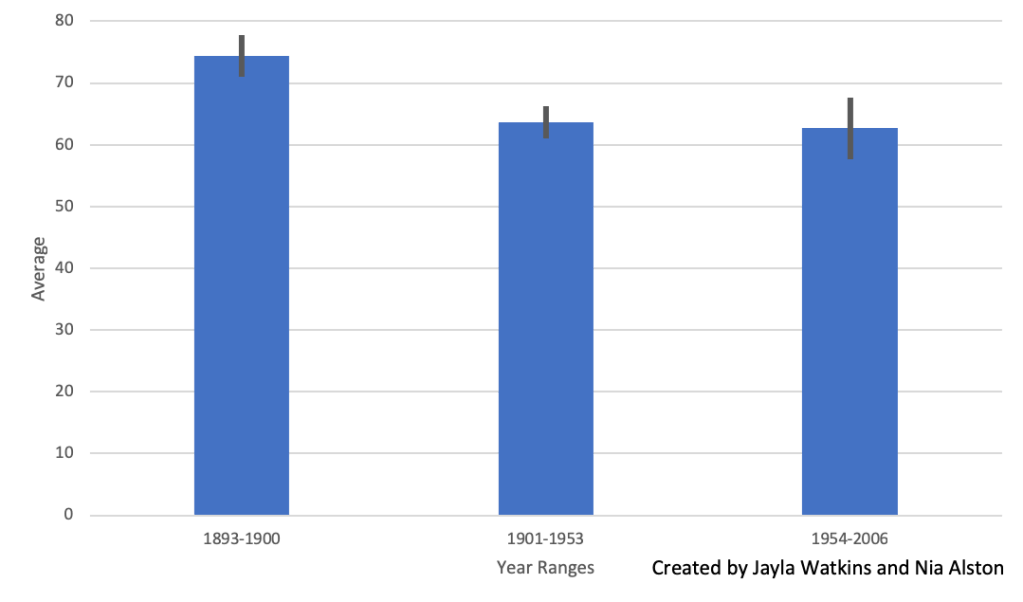
3.How does bee activity and orchid flowering timing compare from the beginning of the century (1848 –1900) to the end of the century (1954 –2006)?
In the beginning of the century, between the years 1848-1900, the average for peak flowering times was 76.7. At the end of the century, the average for peak flowering times was 74.2. As seen in Figure 4, the average peak flowering times over the years have fluctuated between higher and lower temperatures. Between the years 1848-1900 the average bee first flight was 74.3, and between the years 1954-2006, the average was 62.7. Figure 5 shows that the average bee first flight took a significant decline between the years of 1848-1900 and 1901-1953. This decline remained relatively constant after 1953.
4.Predict how continued increases in global temperature might affect the reproductive success and abundance/existence of Ophrys sphegodes. Use evidence from the graph to support your prediction.
The reproductive success of the Ophrys sphegodes is heavily based on insect pollinators, such as bees. When insect pollinators, like bees, emerge, they need the pollen of plants to be successful and be able to participate in activities, such as reproduction. If the plants have not bud when the insects emerge, the insects will find a new plant to pollinate with; thus, leaving the plant without a pollinator and hurting its reproductive success. The graph shows that Ophrys sphegodes do not bud until they are in higher temperatures, and may of the bee first flight events take place at lower temperatures. If the majority of bees were to try and find plants to pollinate at these lower temperatures, many of the plants would lose pollinators; thus, hurting the reproductive success of the Ophrys sphegodes.
This section was completed by Nia Alston.
3: The Relationship between Insect Emergence Patterns and Temperature
As a science communicator, how would you use today’s lab experience to explain the pattern discussed in the Scientific American article titled, Brood awakening: Periodical cicadas emerge early? Are there alternative hypotheses to explain what happened in 2017?
From today’s lab experience and as a science communicator to the general public, I would state that temperature and the time of year go hand and hand, especially in the decade we’re in now. With each new year or decade, we can compare the average temperatures to that of past climate changes to have an accurate overview of temperature fluctuations and the reasons for this. Additionally, climate change has become a huge topic in most day to day discussions and how these increasing temperatures not only affect the human population, but everything within the environment. Moreover, I believe that the scientists in the article were head on with their hypotheses about this particular species. Like stated before, climate change directly affects the processes and functionality of both humans, animals, plants, and insects. Consequently, this throws off the entire balance of nature and how all things within it are forced to adapt to this frantic change.
According to a 2016 Pew Research Poll, roughly half of United States adults say climate change is due to human activity and expect negative effects due to climate change. As a science student and communicator, what are examples climate change impacts that the general public might have experienced? What are some challenges associated with communicating to the general public about climate change?
Based on the 2016 Pew Research Poll, half of Americans realize the impact that humans have had on climate change and its negative effects. One effect of climate change that affects the general public is the drying of lakes which affects drinking water. Many lakes in the western United States are so dry that it now is beginning to affect the groundwater supply for billions of people. Climate change has also affected human health. Burning fossil fuels leads to and increase in air pollution—affecting the respiratory systems of all citizens. Carbon emissions, causing a greater impact from climate change, along with other sources have caused an increase of the Earth’s temperature. This temperature increase of the Earth can lead to heat-related illnesses and overall damage to human health. One of the main challenges of communicating to the general public about climate change is the amount of people who may disagree with climate change. Those who believe in climate change usually have no problem taking in issues and ideas associated with climate change, but those who do not believe in it usually do not wish or want to be persuaded. Today a lot of the general public’s opinion on climate change is based on politics. Climate change communication to the general public is based on ease of communication and how political parties talk about climate change play a significant in the public’s view of climate change (Anwar). While it is important for the public to make their own decisions on topics like climate change, the media and other outlets have a strong pull on citizen’s opinions.
This section was completed by Nia Alston.
References: Anwar, M.A., Zhou, R., Sajjad, A. et al. Climate change communication as political agenda and voters’ behavior. Environ Sci Pollut Res 26, 29946–29961 (2019). https://doi.org/10.1007/s11356-019-06134-6.
The first and third sections of this post were completed by Jayla Watkins. The second and fourth sections of this post were completed by Nia Alston. The six graphs were completed by Alston and Watkins, collaboratively, with the use of Microsoft Excel.
What is science communication according to the presenters? How does it differ from Monica Feliu-Mojer’s definition of science communication?
According to the presenters, science communication is about being able to effectively communicate a body of work in science to non experts, which is referred to as the general public. You are obligated to discuss work with other scientists as well as a wider stakeholders. This method of communication is different than the usual means of communication between scientists and colleagues. The style of writing differs, such as diction, the audience it is being delivered to, as well as the message itself. This definition differs from Monica Feliu-Mojer’s definition of science communication due to her defining science communication as effectively transmitting one’s message clearly which can range from peer-reviewed work all the way down to a tweet -J.W.
Why is science communication important to researchers and the general public?
Science communication is important to researchers and the general public because of the vitals topics around global issues, as well as discoveries that affect each and every one of us. In the United States, tax dollars go towards the funding that a lot of scientists obtain for their research and experiments, which is also another reason why communicating the findings and data is so important. -J.W.
How does science communication differ from scientific dissemination? Why is each important?
Science communication differs from scientific dissemination due to dissemination being the bulk of most scientists and researchers jobs. This task they have is to create papers and get them peer reviewed before they can be published in a scientific journal. On the other hand, according to the speaker, scientific communication is intended to inform and reach out to society and the audience is for the general public rather than the regular scientific community. -J.W.
Alan Alda: Science Communication
According to Alda, “Everyone is too ignorant about science. That is what science is about: Science is about satisfying the ignorance we all naturally possess.” What do you think Alda is trying to convey in this statement about the role of the scientist and the general public? What challenges do you see with this type of engagement?
I believe that Alan Alda in this particular statement is conveying that we all tend to think that we know everything there is to know, which closes are minds to the possibility that we actually don’t. Considering that there’s so much to learn and know about science, we often don’t take the time to expand our minds and ranges of what’s valuable and what’s not. Additionally, when dealing with science related things, we tend to accumulate a bunch of assumptions from non-expertise, and craft our understanding of the matter into something that is the total opposite of what it is. This creates an ignorance and a sense of mockery towards the scientists that take their time to communicate findings and data to the general public. This statement also can be referred to as “the more you know, the more you grow” and vice versa. -J.W.
The more you know, the more you grow
How might you design your blog to reflect the aims of science communication?
The most important aspect of the design of the blog is to make the design simple enough for easy navigation of our audience while also being aesthetically pleasing to readers. The blog will be designed to make it as simple as possible for all to find the latest blog posts and research on a certain topic. We will also integrate a comment section into our blog because comments lead to discussion which is a major aspect of science communication. Comments allow for a reader to give their opinions, information, and emotions on a subject which can trigger someone to put in more in-depth research on a topic. The design of the blog will not be overwhelming and will welcome all audiences from all backgrounds to feel welcome in the science communication community. -N.A.
Mónica I. Feliú-Mójer’s Effective Communication, Better Science
How does the author define science communication? How have you used science communication in your life?
Mónica I. Feliú-Mójer defines science communication as an activity that involves one person transmitting science-related information to another. She further explains that this can be as formal as a peer-reviewed article or as casual as a tweet or post on social media. I have used science communication in the background and discussion sections of lab reports, in day-to-day discussions with others about trending scientific topics—such as global warming, and I will begin to use science communication on a weekly basis as this blog grows and becomes a mechanism for thought and analysis of multiple science topics. -N.A.
Why is effective communication important in science? How might scientists and non-scientists benefit from effective communication?
Effective communication is the ability to discuss a message simply and concisely so that it can be universally understood. Communication, specifically social learning associated with observing and engaging, is a defining characteristic of humans (Dietz). When a topic is communicated effectively, the most basic audience can begin to understand, and the most advanced will be able to take the science further and delve deeper into the topic. Science, like many other subjects, is a topic that can be overwhelming for many, but a strong understanding of the discipline is vital for everyday life. -N.A.
As a science student, what are some challenges associated with science communication? What might you gain from learning effective science communication?
As discussed in Feliú-Mójer’s article, one challenge of science communication as a student is discussing a topic simply and effectively. As students, we are not experts in our fields of study, but we do have access to an abundance of peer-reviewed articles, astute educators, and notable research. This can lead to a student’s communication being overwhelming and containing topics that go over their own heads. Another challenge with science communication is the time and energy to make the communication effective. Keeping up with a blog, or any means of social communication, can be difficult, but success in doing so can lead to greater public interest. Learning effective science communication allows for a larger audience which can lead to interdisciplinary research—permitting multiple perspectives to give insight on a topic. Effective science communication allows data and research to become accessible for all audiences and imperative for science-based action. -N.A.
What do you think might be the strengths and weaknesses of the blog?
One, out of many, strengths of the blog titled “It’s Okay to be Smart,” is the title itself. In today’s society there is a stigma around people knowing too much, which consequently forces the labels “geek” and “nerd” upon certain individuals. Putting myself in the shoes of someone who doesn’t read anything because of these very reasons, I would be intrigued when stumbling upon a blog that spoke to me directly about gaining more knowledge. I also think another strength of this blog is the topics discussed and the writers ability to effectively communicate with its targeted audience. For example, one of the topics on the blog is titled, “Science debunked.” This automatically caught my eye considering how reliable science information is supposed to be, and how some pieces of info are not. Additionally, the writer does a great job with incorporating visuals and hands on learning for readers. One of the weaknesses of the blog is that some of the videos can tend to be a bit lengthy and may scare away individuals coming to the blog looking for insight on the posted topics. -J.W.
Take a look at some of the blog topics. Which titles or topics were most appealing to you, and why?
As stated in the previous questions, for example, the video titled “Science debunked” was very intriguing to me considering that I’m the type of person that likes to know the truth about the foods I put into my body, which was discussed. Also I think people like myself want to know the utmost truth about anything dealing with science and the world around us. Another interesting topic on the blog is the video titled “Why Money Isn’t Real.” In this video the author of the blog discusses how paper money holds less value than we think it does in comparison to the expensive machines that actually produce it. I believe that this very topic would be the bait for many individuals considering how money rules everything around us this day and age. Additionally, the author does a great job at communicating and reaching a general audience with scientific facts to back it up. -J.W.
Find and read at least two blog posts. Which blog posts did you read and what did you think of them?
The posts from “It’s Okay To Be Smart” differ from a traditional blog, for they are videos instead of text posts. The first video I watched was titled “Are We All Related?” I chose this video because I enjoy learning more about genetics and ancestry; the video is also one of the blog’s most popular so I was more intrigued to watch. This video was very concise and interesting; it discussed topics in an intriguing way, specifically because of the images and videos that went along with the narrations. The length of the video was around six minutes which I appreciated. Personally, I begin to get uninterested in super lengthy videos and I think the creators of this blog recognize that in the majority of their posts. The second video I chose to watch was “Why does February Only Have 28 Days?” The question is something that I have never thought about, for I see it as a normal thing that I have simply accepted. This video did not easily communicate its topic which differs greatly from the first video I watched. I was not alone in my slight confusion as many of the comments of the video discussed how they did not understand anything or were lost the entirety of the video. -N.A.
What might you do differently or similarly with your blog?
The “It’s Okay To Be Smart” blog seems to be used as a platform to access the blogger’s other sites. Their homepage leads to their YouTube channel, and all of their posts are YouTube videos. Our blog will consist of text posts; on occasion, we may attach a video to help further explanation of a topic, but all of our posts will be text posts. The blog does use intriguing thumbnails and picture that intrigue viewers, and we hope to do the same with the images included in our blog. -N.A.
Work Cited: Dietz, Thomas. “Bringing Values and Deliberation to Science Communication.” Proceedings of the National Academy of Sciences of the United States of America, 12 Aug. 2013, pp. 1–7., doi:10.1073/pnas.1212740110.